Redesigning Enerlytiq
OVERVIEW
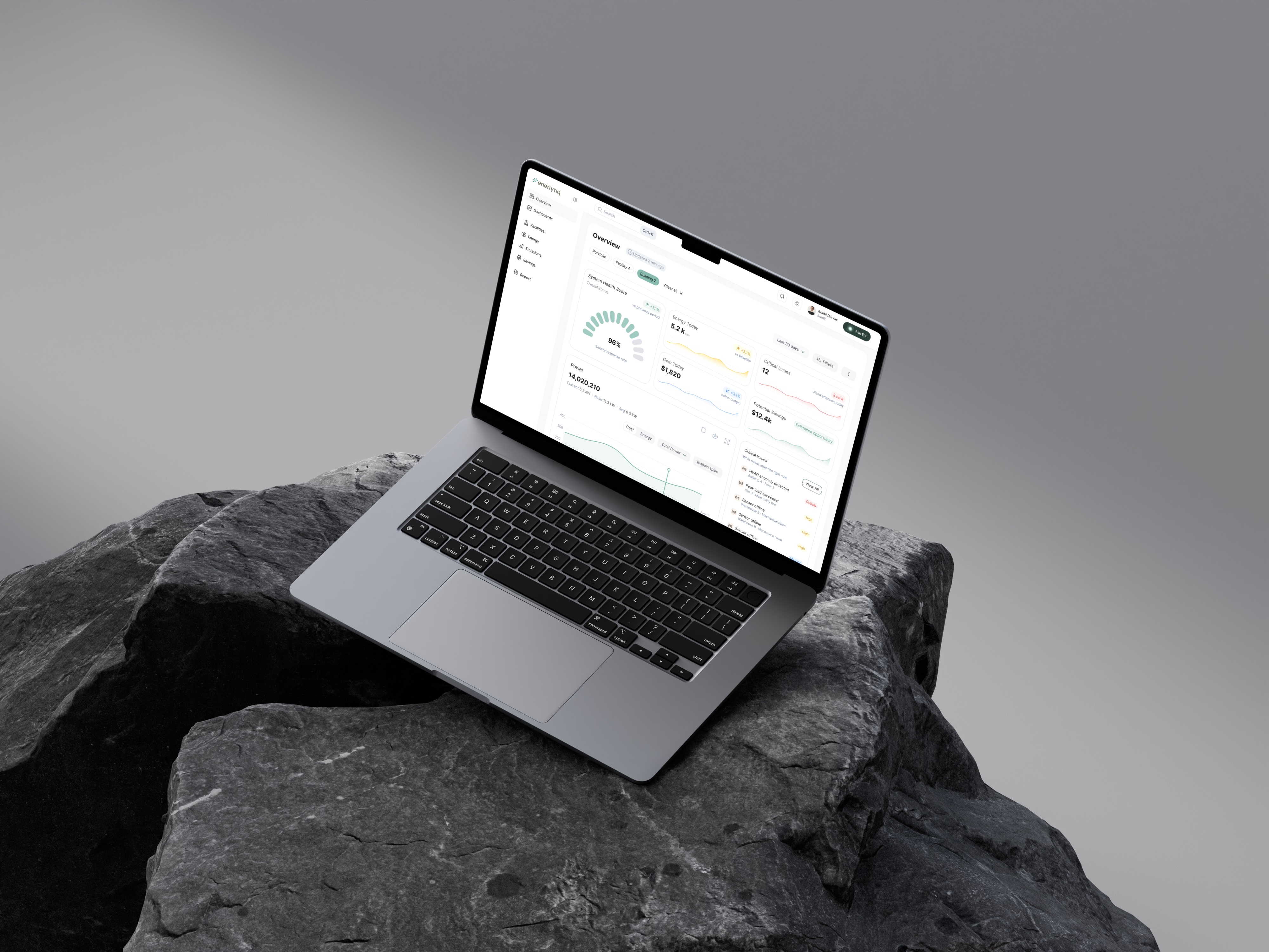
Enerlytiq is Enerva’s Energy Management & Information System (EMIS), used by operations teams to monitor energy usage, detect inefficiencies, and manage performance across multiple facilities.The platform integrates data from meters, sensors, and building systems into a centralized interface.
While it was technically robust, it struggled where it mattered most - usability and decision-making. Users had access to a large volume of energy data, but found it difficult to interpret, navigate, and act on it. I led the redesign of Enerlytiq to transform it into a system that helps users move seamlessly from data → insight → action, while reducing friction and improving clarity across the experience.
CHALLENGE
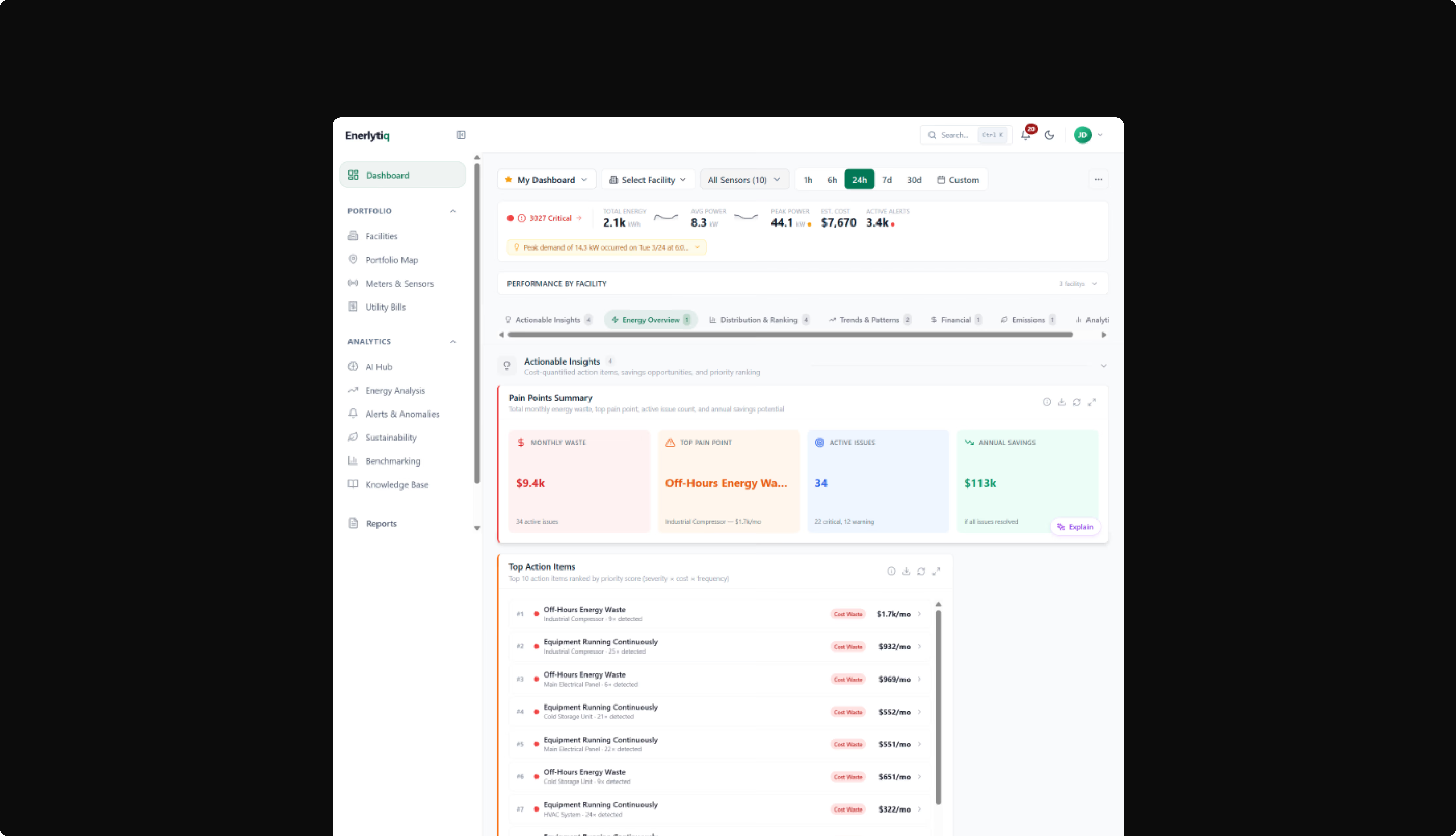
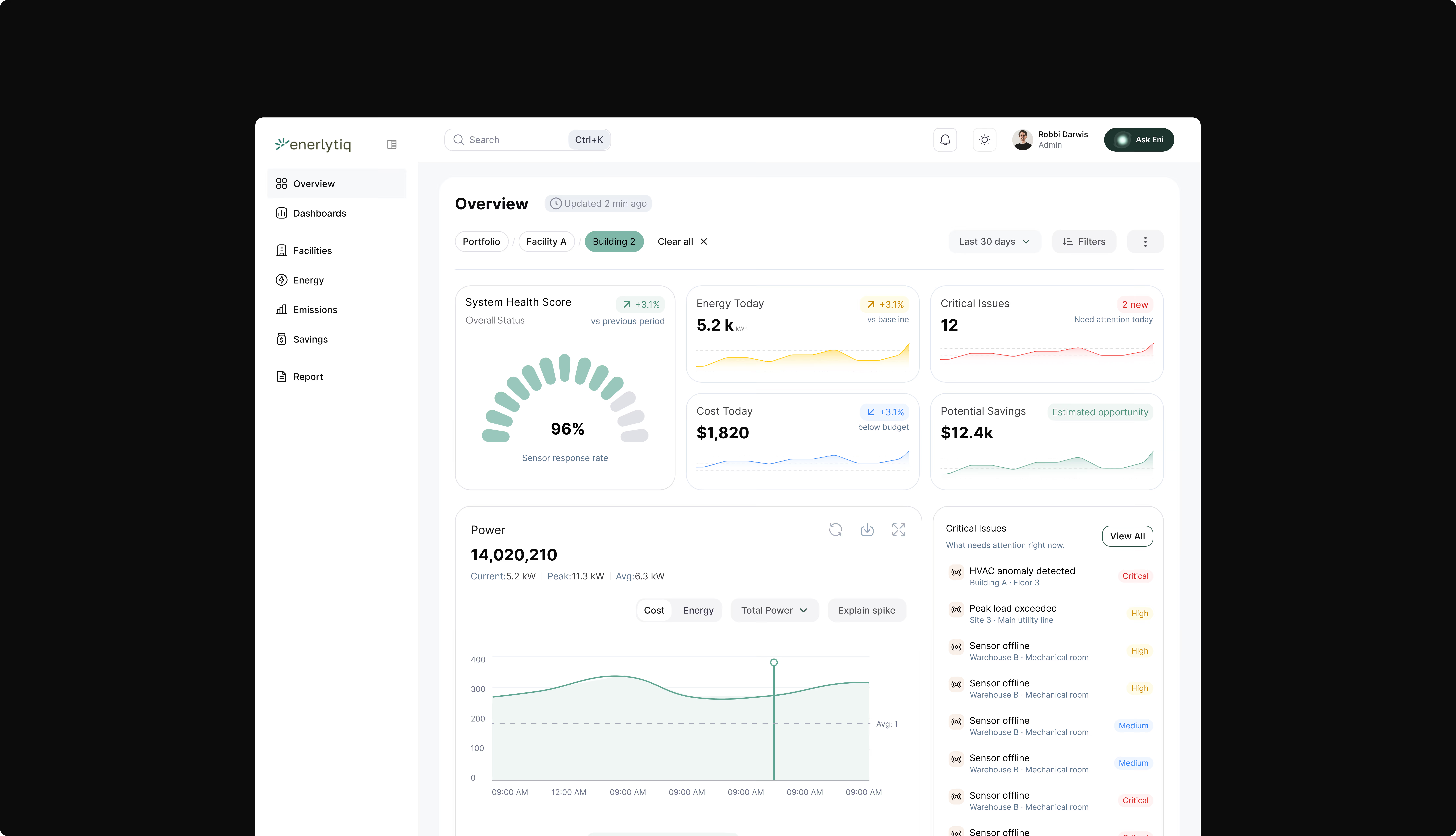
The platform wasn’t lacking features — it was difficult to use. As I dug deeper, a few core issues became clear:
Overwhelming interface with no clear hierarchy
The dashboard tried to show everything at once. Charts, metrics, and insights all competed for attention, making it hard for users to know where to look first.
Excessive and inconsistent use of color
Too many colors were used across charts and widgets without a clear system. Instead of guiding attention, it created visual noise and made the interface harder to scan.
High cognitive load when interpreting data
Users had to manually compare values, read multiple charts, and interpret patterns on their own. Even simple questions required effort because the system wasn’t providing enough context.
Navigation didn’t match how the system actually works
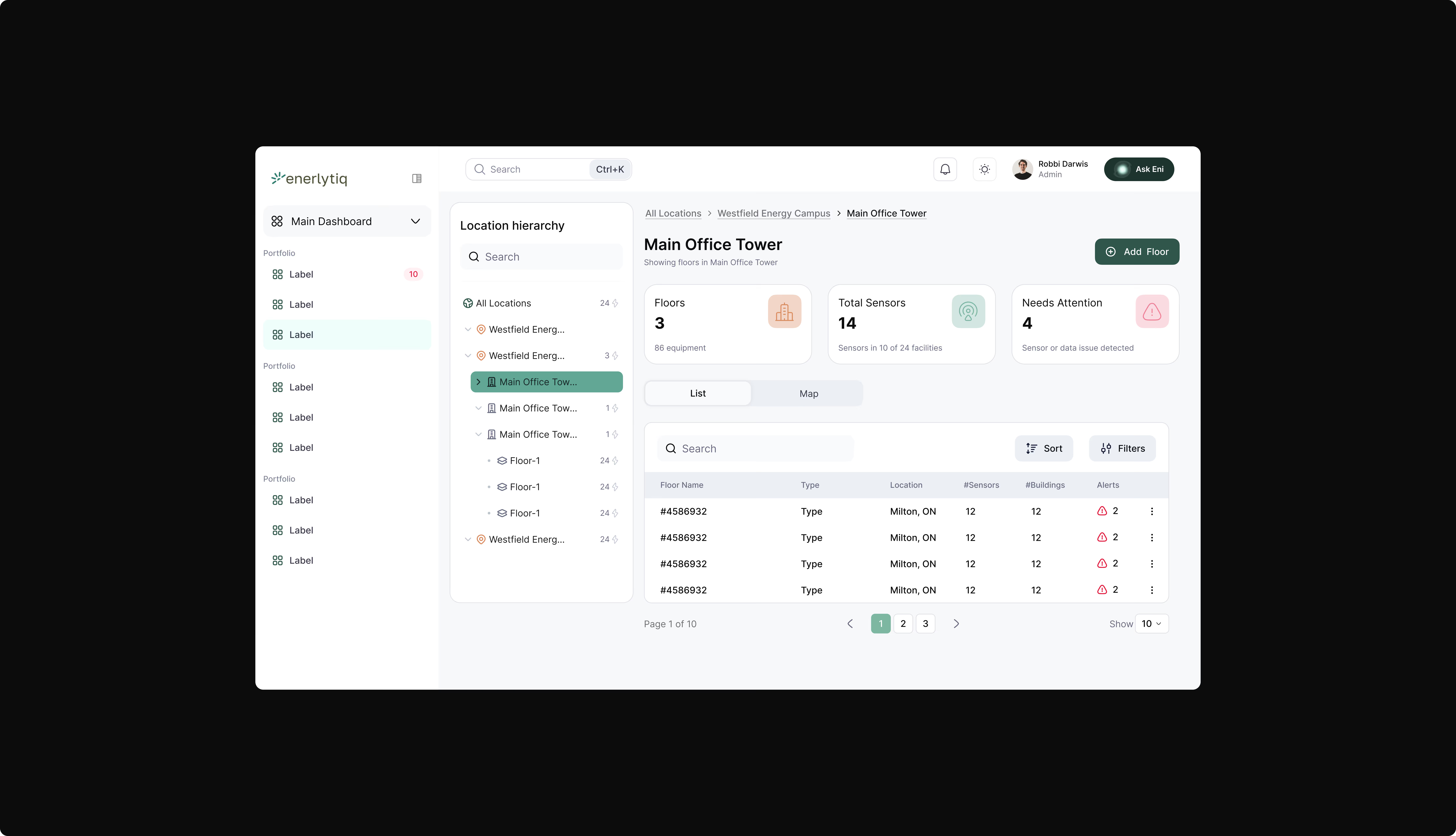
The platform didn’t reflect the real-world structure of facilities. Moving from a high-level view to specific equipment felt disconnected, and users often lost context.
Insights didn’t lead to action
The system could surface anomalies, but it didn’t explain them or guide users on what to do next. This made the experience feel incomplete.
Research & PROBLEM
Before redesigning, I focused on understanding how users were actually interacting with the platform.I started with heuristic evaluation, reviewing the interface against usability principles to identify gaps in hierarchy, consistency, and clarity. This quickly highlighted issues with visual overload and navigation. I also did task-based walkthroughs, putting myself in the user’s position and trying to answer common questions like:
-
“What’s wrong right now?”
-
“Where is this issue coming from?”
This exposed how much effort it took to move between views and piece information together.Alongside this, I gathered internal feedback and observations from how the platform was being used. A consistent pattern emerged — users weren’t asking for more data, they were trying to make sense of what already existed.
What I found was simple:The system wasn’t guiding users — it was expecting them to figure things out on their own.
Solution
1. Action-Driven Dashboard
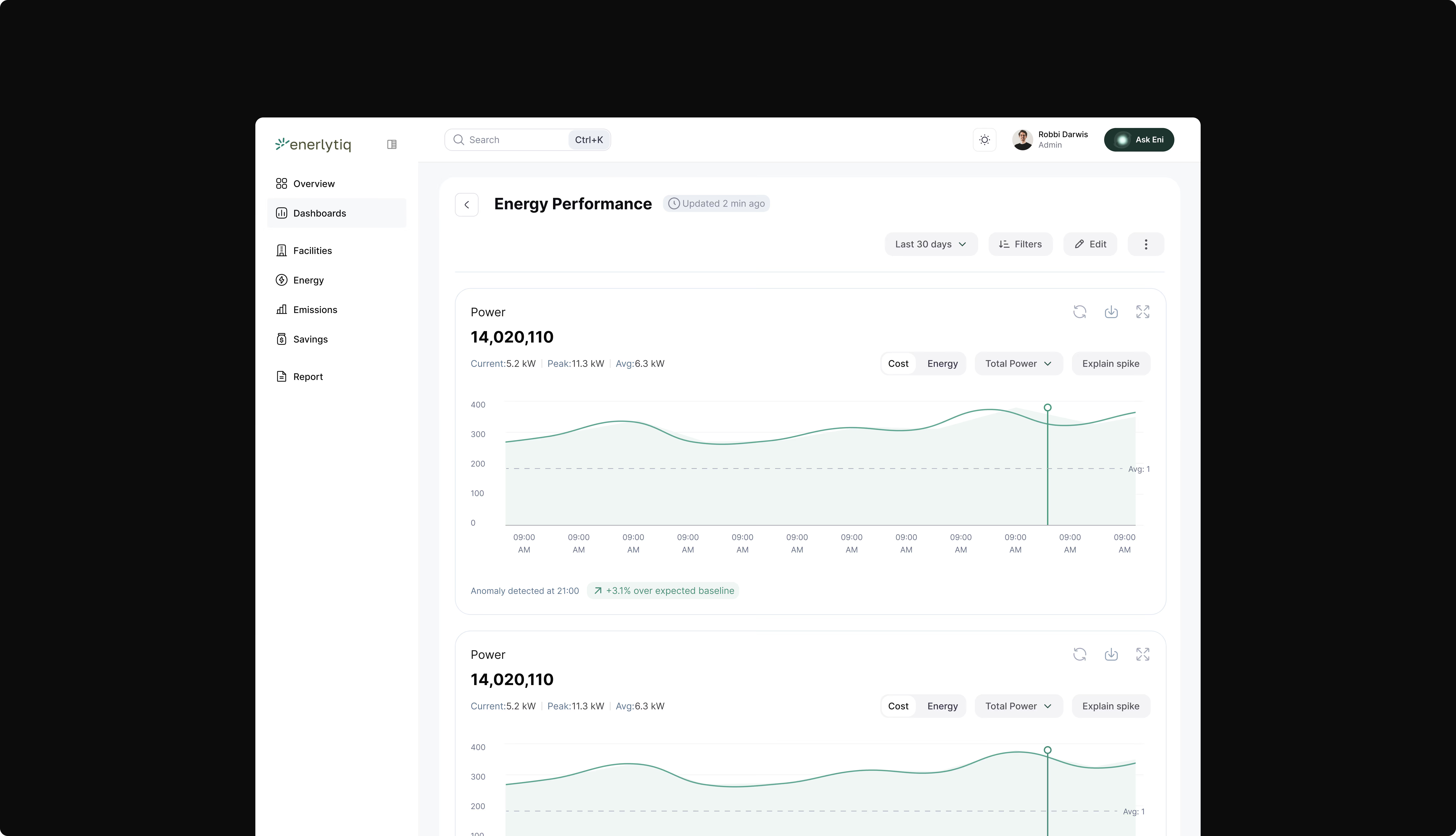
2. Improved Data Visualization
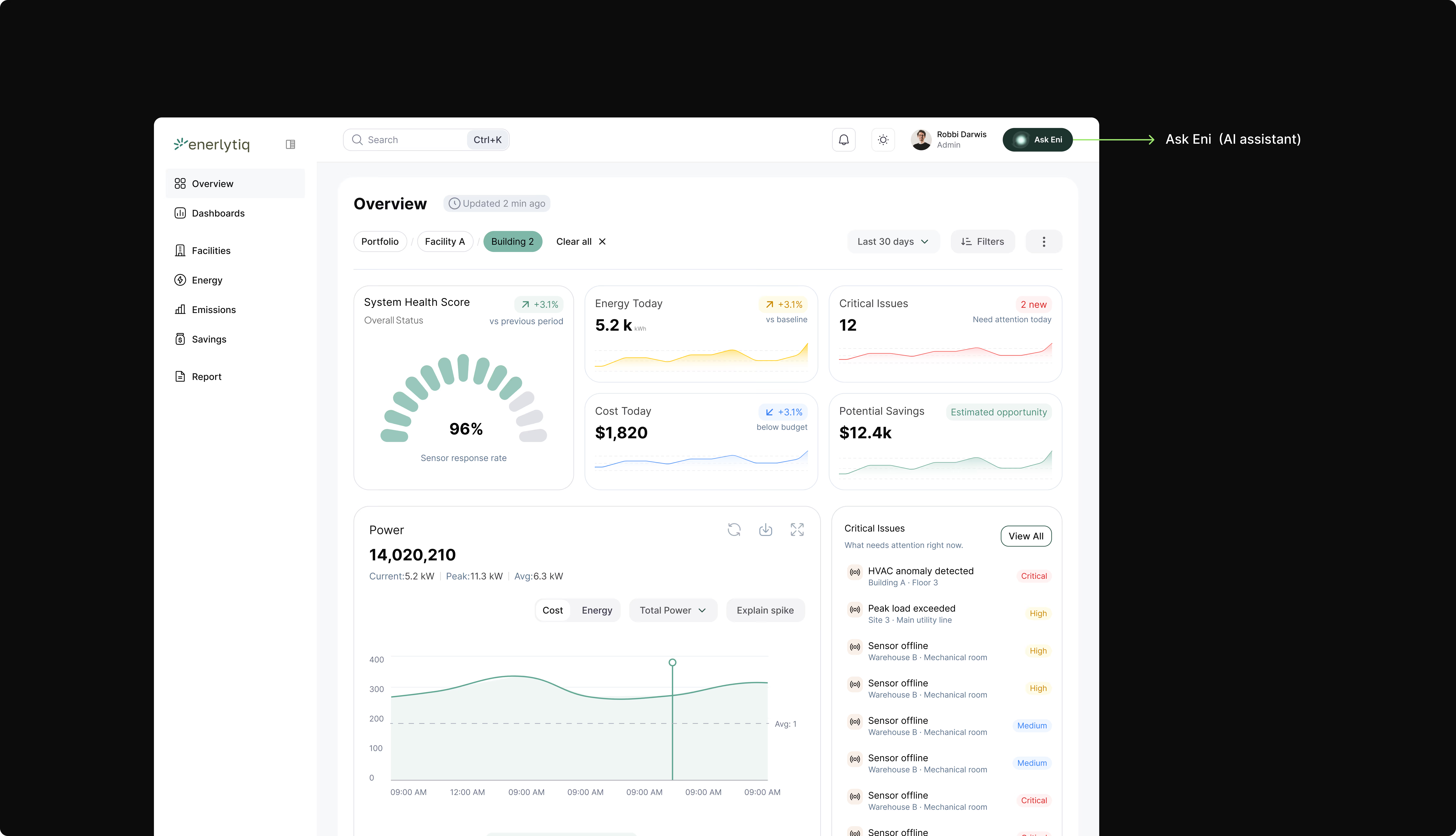
3. Ask Eni (AI Assistant)
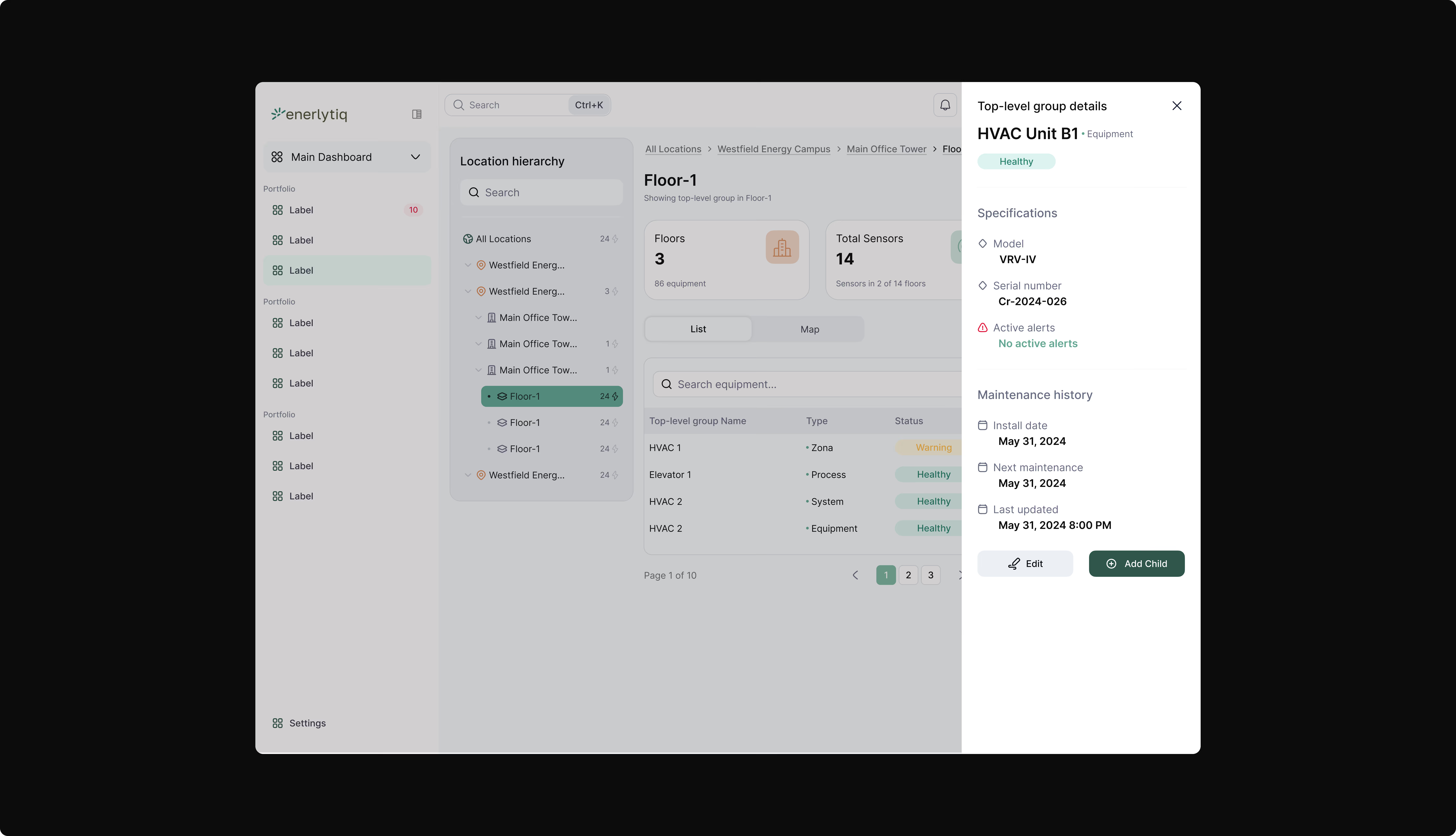
4. Clear System Hierarchy
5. Seamless Filtering and Navigation
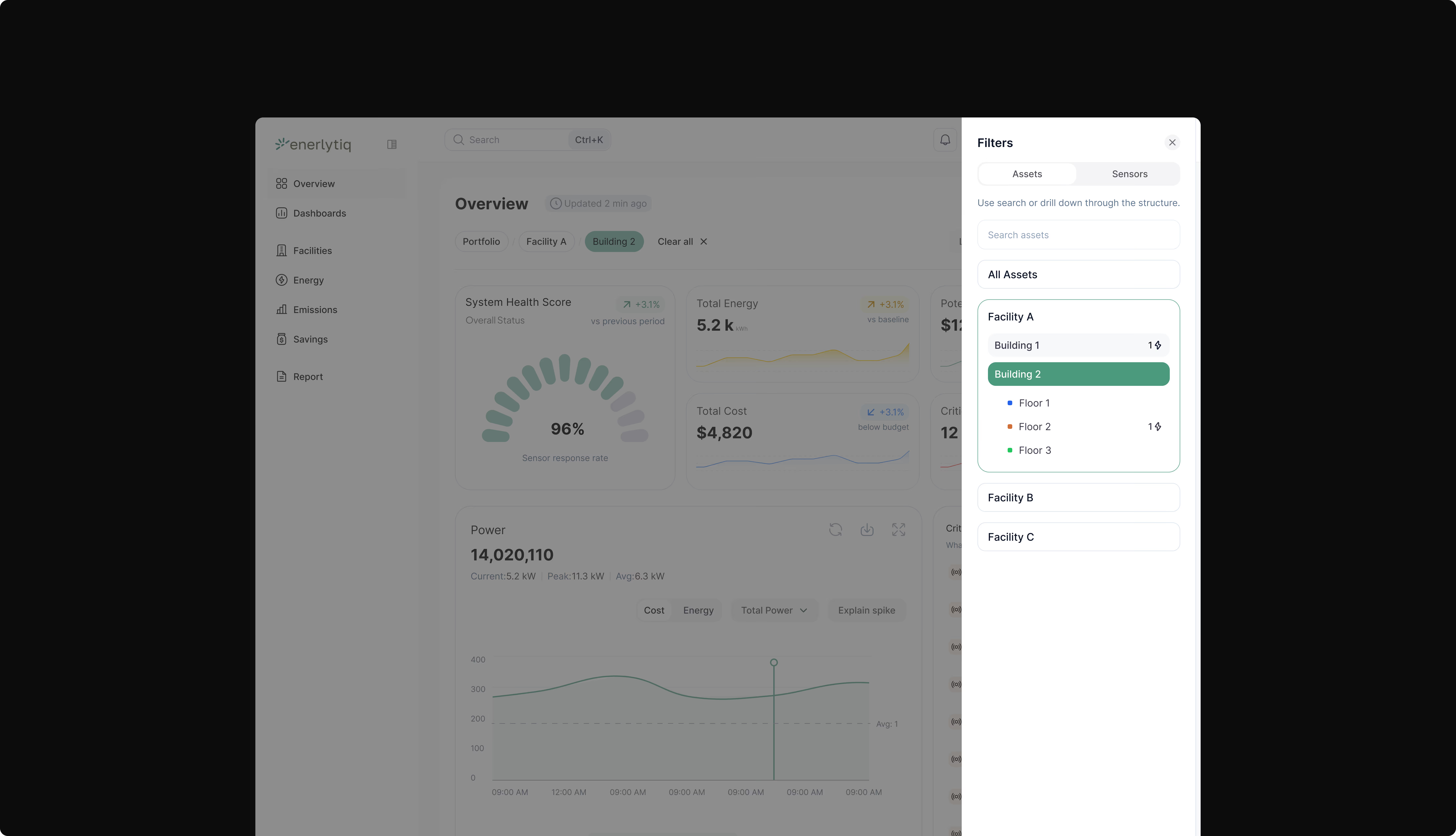
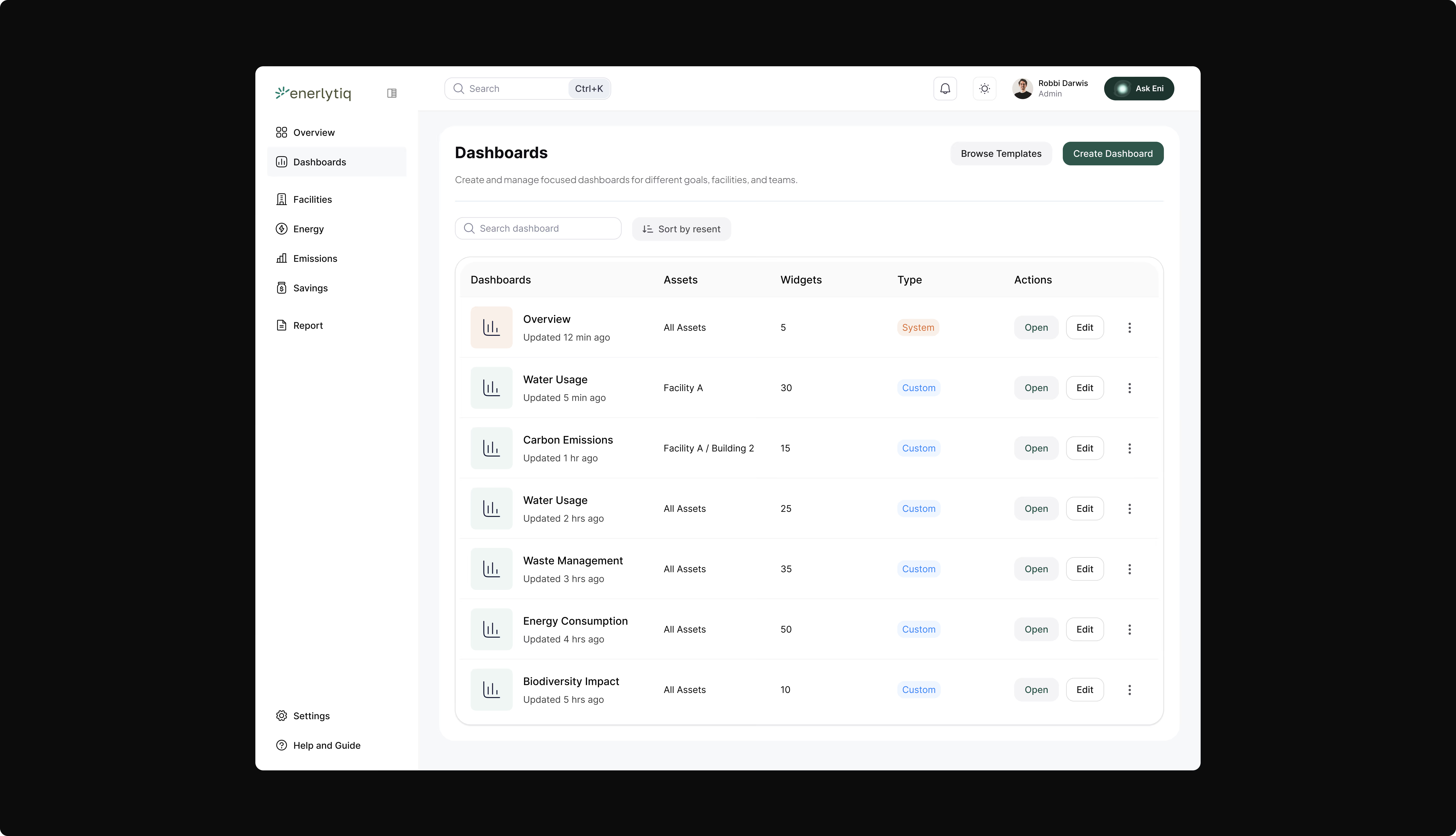
6. Customizable dasboards
7. Equipment-Level Insights
Iteration
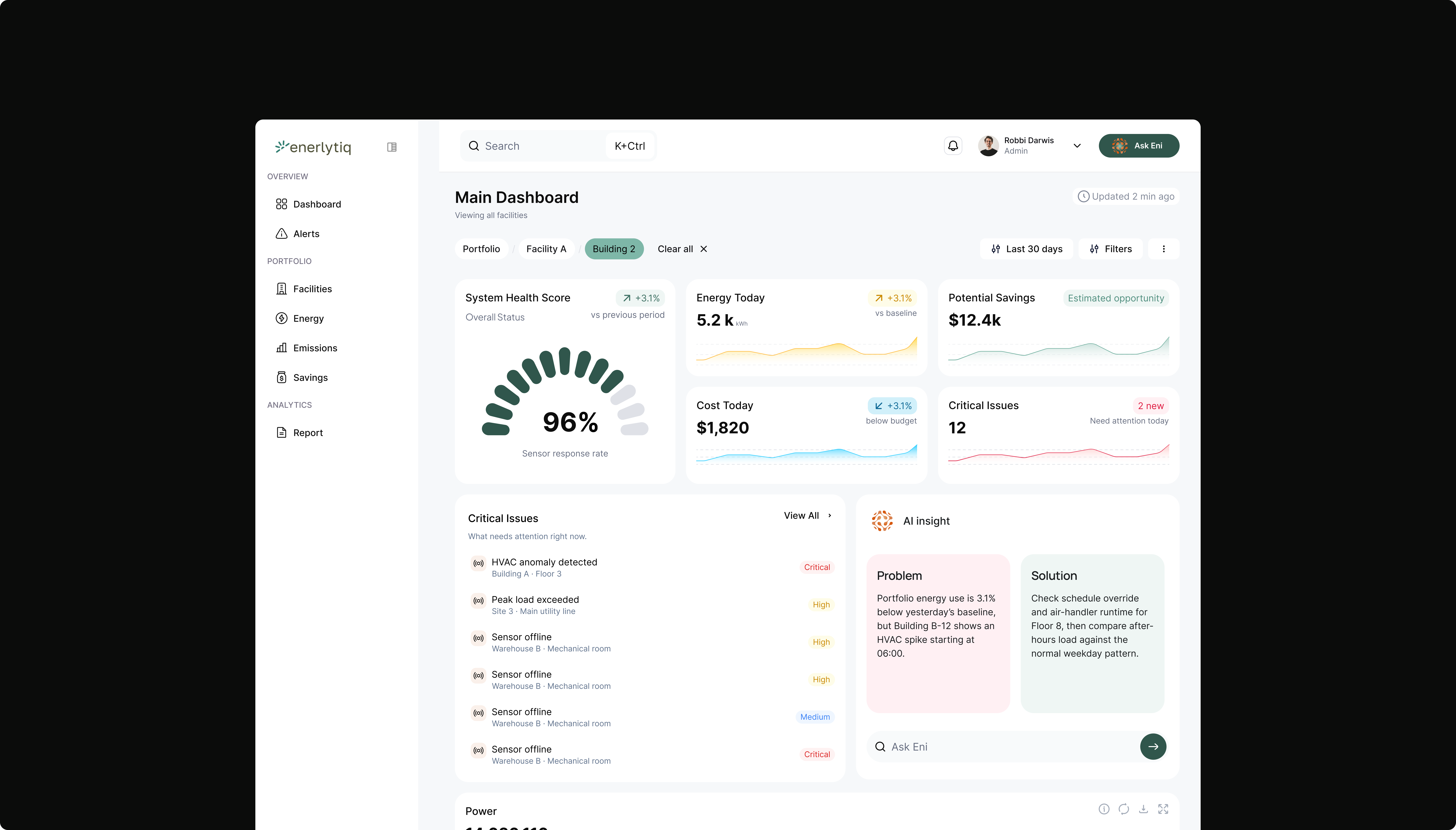
After usability testing and stakeholder feedback, we noticed users could identify issues on the dashboard but still struggled to understand why the issue was happening and what action to take next.
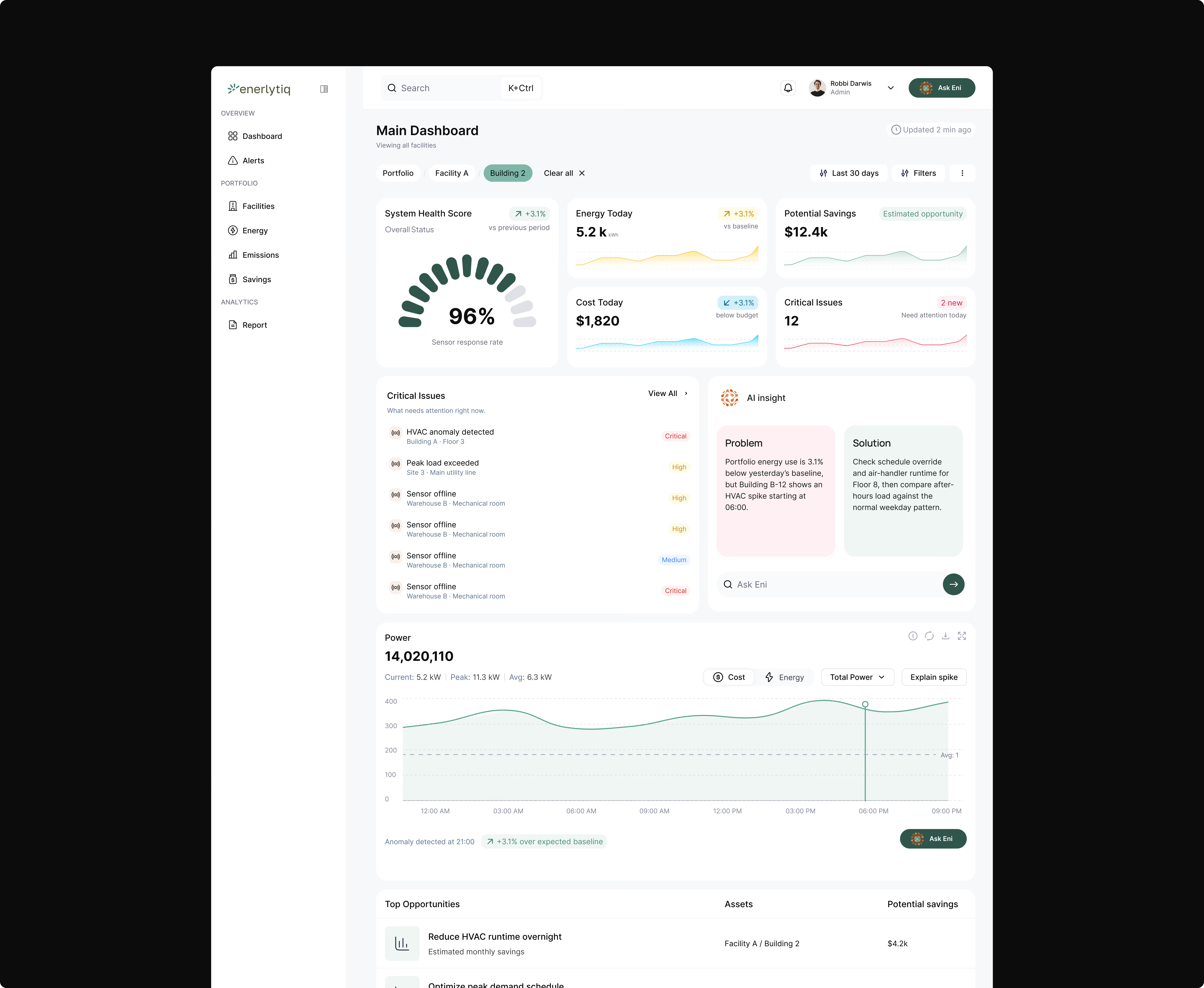
To improve this, I introduced an AI Insight section beside the Critical Issues panel. Instead of only displaying alerts, the dashboard now summarizes facility-level problems in plain language and recommends possible solutions.
I also added an “Ask Eni” interaction directly within the dashboard so users could ask follow-up questions and get deeper insights without leaving the experience.This iteration made it easier for users to not only spot issues quickly, but also understand what was happening and what steps to take next without digging through multiple dashboards.
Outcome
The redesign transformed Enerlytiq from a data-heavy monitoring platform into a decision-support tool.Users can now quickly identify issues, navigate facility structures more intuitively, understand anomalies with contextual insights, and access answers directly through Ask Eni.
Most importantly, the platform now guides users toward action instead of expecting them to interpret everything themselves.
Learnings
-
This project showed me how much clarity and structure matter in complex systems. I learned that reducing visual noise, especially by fixing inconsistent color usage, and aligning the platform with real world hierarchy made the biggest impact on usability without needing to add more features.
-
I also learned the importance of working closely with stakeholders. Aligning design decisions with product managers and developers helped ensure the solution was practical, scalable, and met both user and business needs. Separating the main dashboard from custom dashboards and integrating Ask Eni reinforced that features like AI only add value when they fit naturally into the user’s workflow.